For my Human-Computer Interaction course, my team was tasked with identifying a struggling user group on campus, discovering their problem, and designing a relevant solution. Our identified user group was undergraduate computer science teaching assistants.
Objective: To create a streamlined, centralized grading experience that consolidates the user work flow for undergraduate and graduate computer science TA’s.
Duration: 3.5 Months
Type: Web UI/UX Design

Overview
For my Human-Computer Interaction course, I was assigned a team with diverse backgrounds ranging from UX research to product management. We were tasked with using the human-centered design process to understand a user group of choice and create a solution that addressed the users’ needs.
My Role
Although I was fully involved at every stage of the design process, I was primarily responsible for the Designing and Prototyping stages. I constantly communicated with my teammates, gave critical feedback throughout project checkpoints, and met tight deadlines.
Approach
The team followed a human-centered design process to ensure that we were tending to the users’ needs. After completing the project, I realized that the team closely followed the Double Diamond model since we went through various cycles of diverging and converging our findings and iterations to ensure an impactful solution.
Discover
To begin specifying a user group, each team member brought five problem spaces observed from personal experiences and/or observations.
We then evaluated each problem space and identified the following user group: non-professionals who want to share knowledge. This was informed by the observed popularity of “YouTube University” and one team member’s mother’s personal struggle sharing educational content outside the classroom.
The team was motivated by the compelling opportunity area of a platform that facilitated sharing knowledge and resources without the barriers of online education subscription platforms, like MasterClass.
However, we realized that we were too far ahead of ourselves. We were becoming too solution-oriented rather than problem-oriented at such an early phase of the design process.
As the team progressed into creating the interview script, I identified a red flag: questions were being framed to illicit the responses we wanted to hear from users in order to support the solution we were already picturing.
We were trying to fit a solution into a problem rather than allowing an observed problem to inform a solution.
I initiated a group meeting to discuss re-evaluating our user group as well as our approach. Eventually, the group decided to re-identify our user group. In our conversation, we realized that the user group was too broad to begin with – it would not be feasible for us to identify members of the user group, let alone recruit them.
We narrowed our user group to the following: undergraduate Computer Science TAs. Given the constant shift in modes of instruction for college courses due to covid, the team had observed that TAs at Cornell were frustrated with changes in routine. Most of these TAs were Computer Science TAs who complained about their experiences, and we wanted to learn more about their struggles to inform us of a solution.
Contextual Interviews
With a more defined user group in mind, the team began understanding user needs and patterns by interviewing five Cornell students who fit into our identified user group.
Our goal was to identify motivations, behaviors, activities, and problems that CS TAs currently face. We did this by asking questions about their experience being a TA as well as asking them to walk us through some of their current activities.
Define
The team then converged our findings by creating an affinity diagram with common patterns and themes found during our user interviews. Using this, we identified and evaluated opportunity areas for our solution.
We decided to focus on the grading process since many of the user’s pain points revolved around this user activity.
Key Takeaways
The main problem that we found was that users did not have a consolidated work flow that provided them confidence and consistency in the grading process.
Users feel overwhelmed by the number of tools required for grading:
The grading process is time-consuming and fragmented:
Users feel unsure of their grading decisions:
Develop
DETERMINING THE DESIGN CONCEPT
After each teammate independently brainstormed 10 potential design solutions, we converged our ideas.
We decided that a grading web application that consolidated all necessary tools while maximizing grading alignment would best tend to our users’ needs.
Many users indicated they grade on the same device they use to do school work – their laptop – thus, a web application seemed most appropriate.
INVESTIGATING THE SOLUTION SPACE
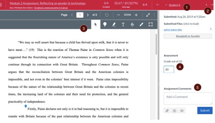
The team then researched the current solutions tending to our user problem in order to identify the MVP feature requirements as well as the gaps that our solution could fill.
Gradescope
+ Consolidated tools
+ Many file types supported
No TA grading support or communication methods
Not tailored to a holistic grading system
Canvas
+ Consolidated tools
+ Many file types supported
No TA grading support or communication methods
Code files not supported
Although solutions currently targeted the user problem of a lack of consolidation of tools, there was a major gap: alignment of grading through resources and communication was lacking. The team aimed to address this gapin our solution.
ASSUMPTIONS & CONSTRAINTS
TASK 1: Grade an Assignment
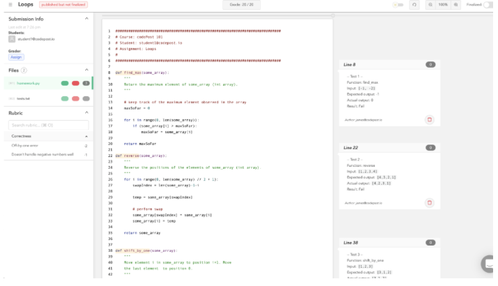
codePost
+ Tailored to code
+ In-line comments
No TA grading support or communication methods
Inconvenient audit of graded assignments
In order to refine our design direction for feasibility purposes, the team identified some assumptions. The user would only be grading code-based assignments. To simplify the designed prototype, we also assumed that the user already has created an account and is registered as a TA through CodeJam.
Although CodeJam would be a comprehensive course facilitation platform where TA users can navigate all relevant classes, assignments, and gradebooks, the project requirements constrained us to design the solution vertically – so we decided to focus on the major features specific to grading.
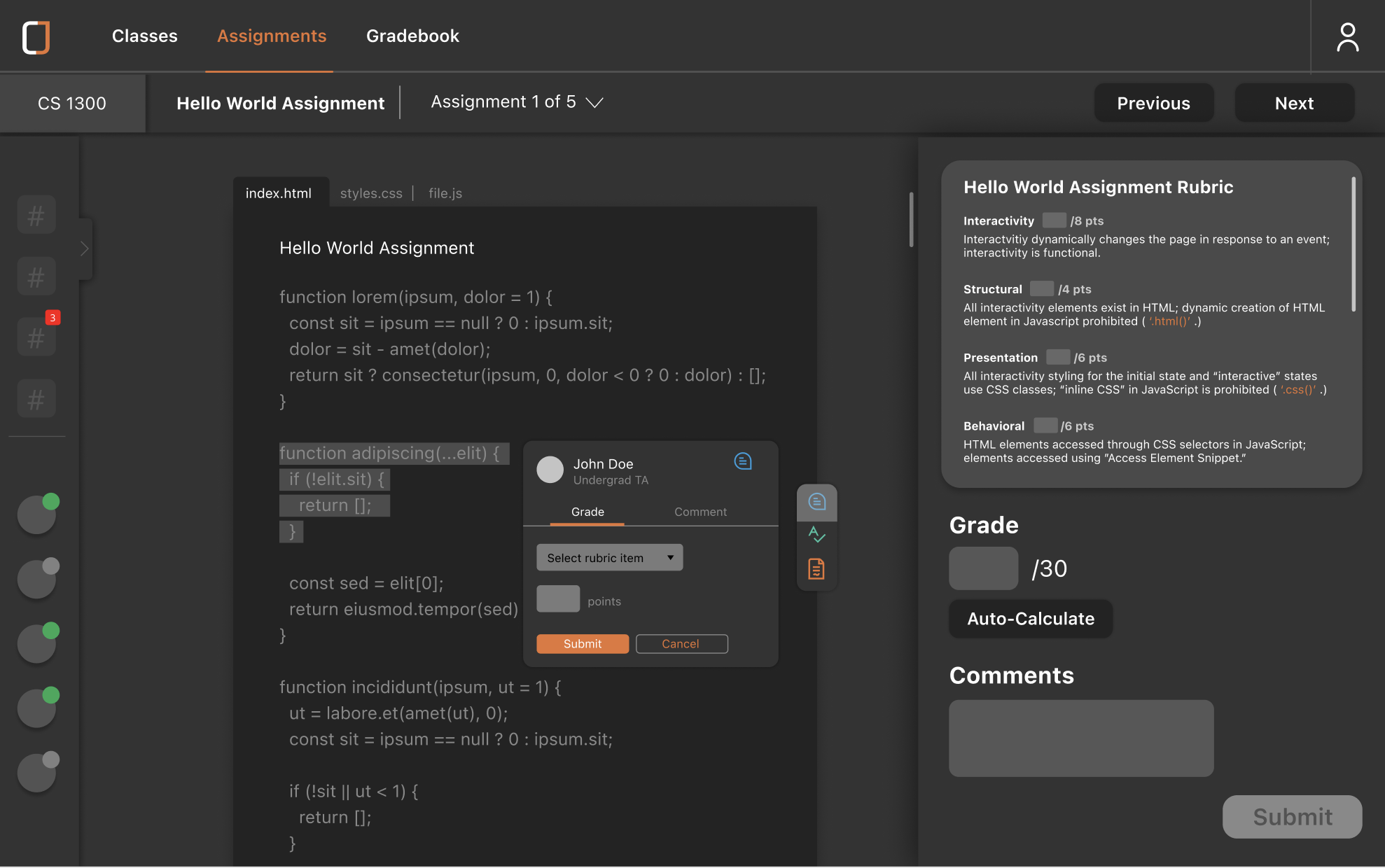
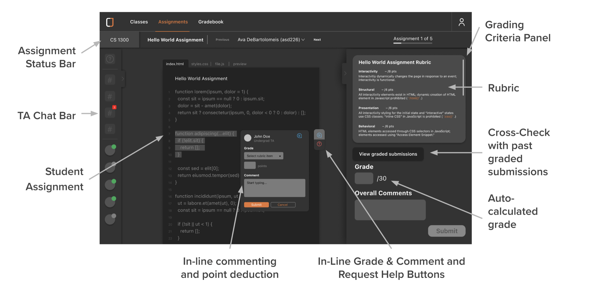
We found that users were currently using an external rubric, opening code in another window, and grading an assignment with no way to make in-line comments. They then re-upload the rubric on the platform students uploaded their work and finally enter grades in Canvas. Our first task aims to consolidate all of these steps into one screen.
TASK 2: Request In-Line Help
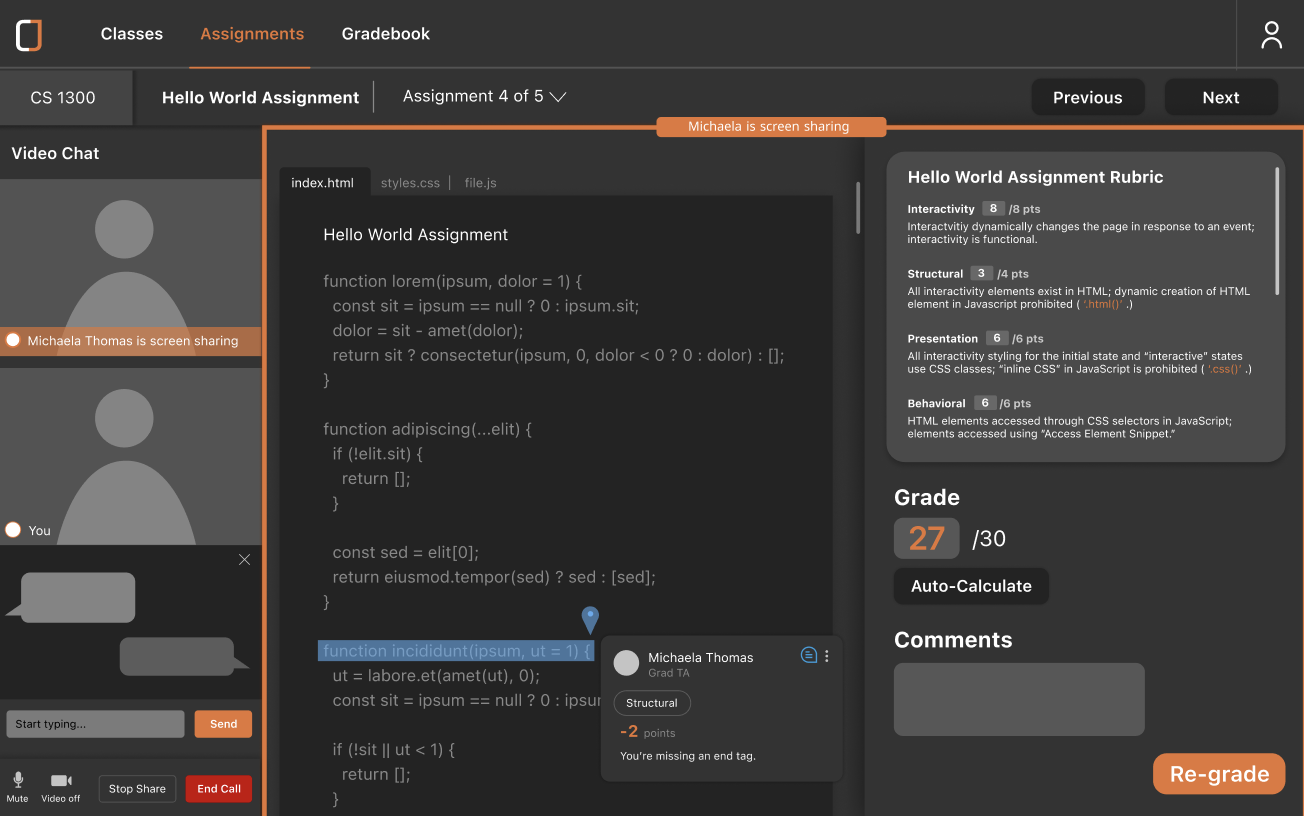
Our interviews informed us that when TAs are having trouble with grading a specific line of code, they would screenshot it and then use an external messaging app to ask a fellow TA for advice on how to grade. We wanted to eliminate these extra steps by integrating in-line communication into CodeJam.
TASK 3: Video Chat to Discuss
We also found that CS TAs found live communication to be faster and easier to get answers to their questions. Thus, we wanted to create a live video chat feature that enabled users to have conversations in real-time and share their screen
TASK 4: Cross-Check Previous Submissions
Lastly, we discovered that TAs had access to some past submissions from other semesters to help them grade, but it was within a separate drive file, which they found inconvenient to navigate to and open considering how many windows they already have open. Therefore, we wanted to enable easier access to these cross-check references.
STORYBOARDING & WIREFRAMING
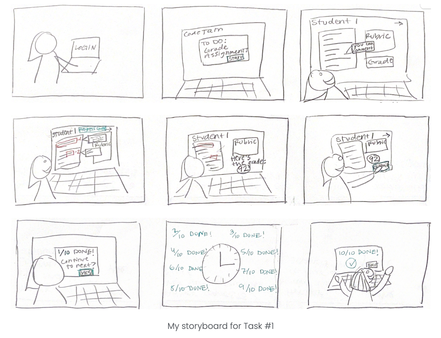
Each teammate then made a storyboard for each of the tasks to better understand how our solution would fit into the user workflow and resolve our users’ goals.
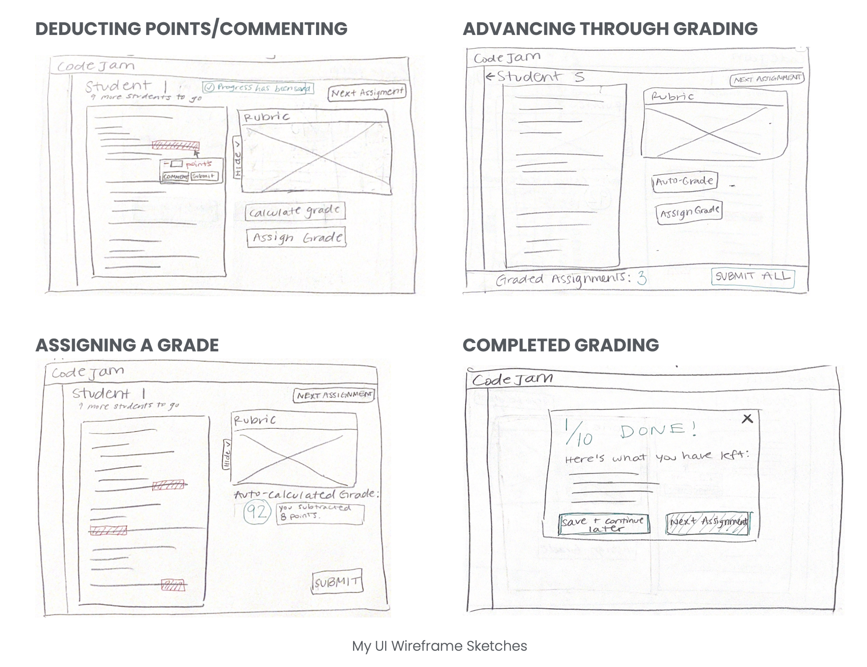
We then sketched UI wireframes to accompany each storyboard. These would inform the paper prototype I created.
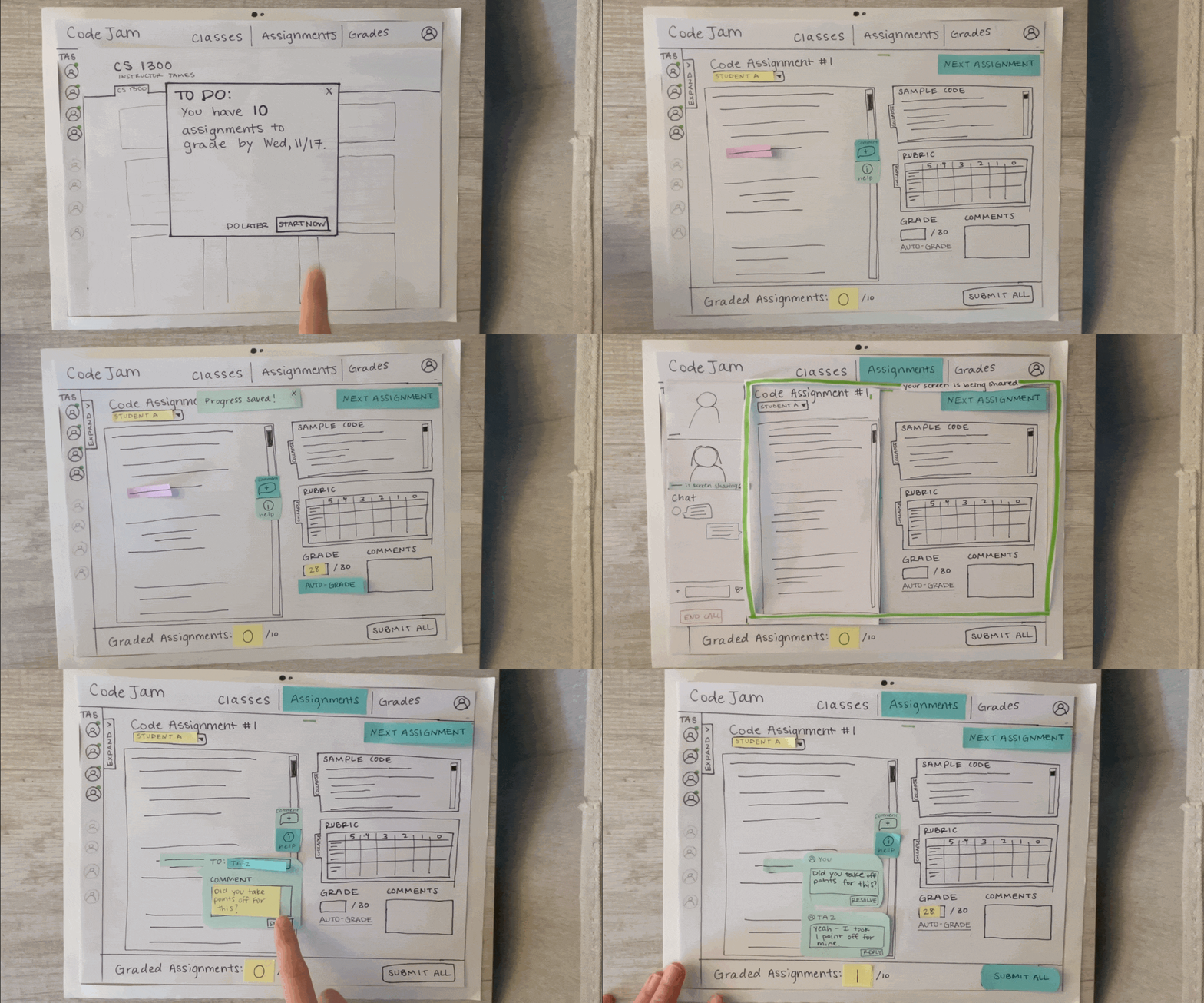
PAPER PROTOTYPING
I created a paper prototype based on the tasks we created to gain preliminary feedback on the design. I user-tested the prototype and analyzed our findings to then advance to the prototyping stage.
I discovered that the rubric wasn’t structured in the way our user group used rubrics to grade. Furthermore, the user requested that rubric items be more integrated into the point deduction user flows. This finding, along with others, would directly influence our first prototype iteration.
Deliver
FIRST PROTOTYPE ITERATION
Justified on the basis of user feedback from the paper prototypes, usability and UX principles and common UI patterns, as well as the persona and requirements, I led the prototyping of the solution with the help of the team.
EVALUATION
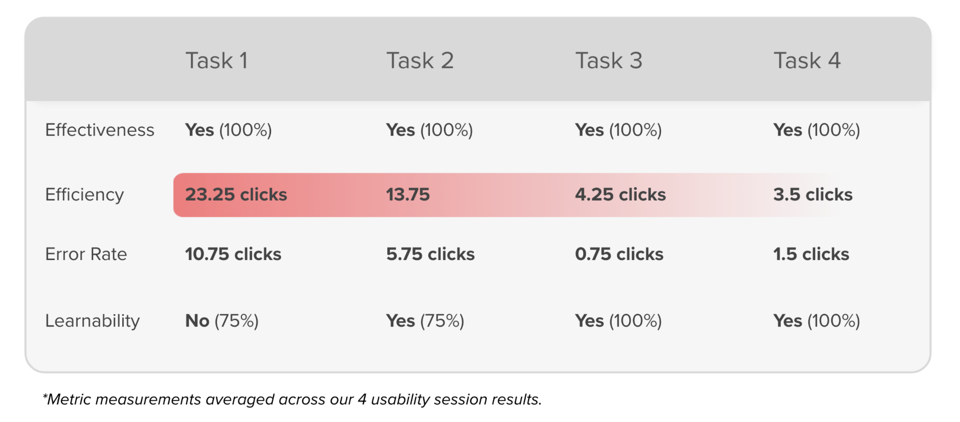
We recruited 4 users to complete the previously outlined tasks with our prototype. Not only did we collect qualitative data, but also quantitative data through several usability and user experience metrics.
After each session, the team analyzed the screen recordings to extract quantitative data. We compiled a Usability Test Analysis Spreadsheet to outline the user problems. From here, we were able to prioritize certain re-design initiatives based on expected impact.
Our qualitative and quantitative data indicated that there was a steep learning curve. This was supported by the fact that users had many more clicks and errors during the first task compared to the last. They also expressed more confusion upon completing the first task.
More specifically, it was clear that there were four major areas to be addressed in our redesign.
• Uninformative Progress Bar
• Grading UI prompting user hesitation
• Lack of onboarding elements
SECOND PROTOTYPE ITERATION
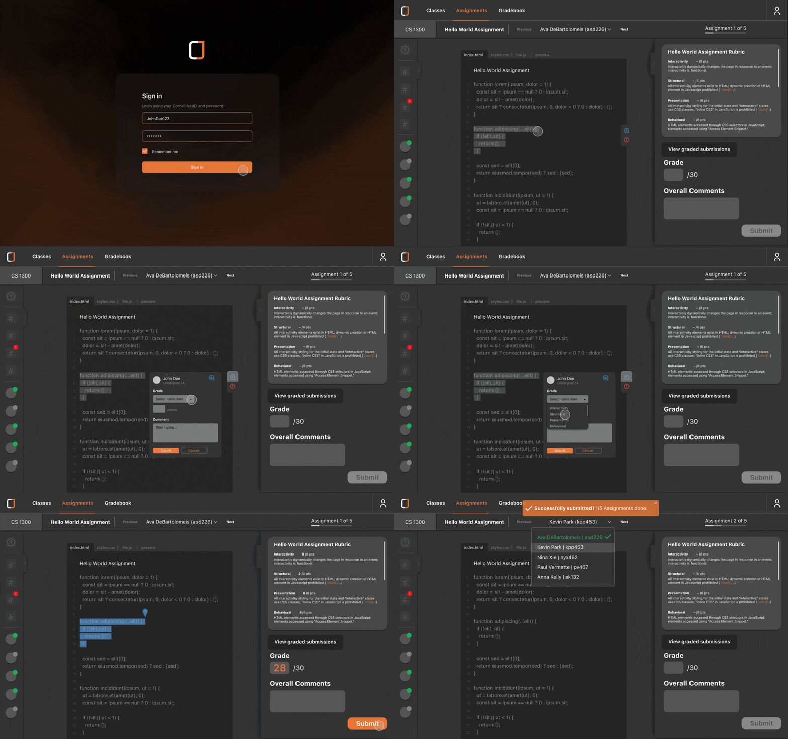
After evaluation of our findings, the team made informed design decisions. All of the features and functions of our solution are outlined below.
Here is a video that outlines the major user problems and how the team resolved these problems with our redesign.
What I Learned
This project really challenged me to coordinate with a team composed of many different backgrounds. I had experience with digital UX and UI design, however, these skills were able to grow in a collaborative situation. The key growth points for me were:
1. Effective communication. The team had multiple blockers and points of contention. Not only did this challenge me to become more succinct in my communication, but I learned how to better listen to my teammates’ ideas and opinions.
2. Putting the user first. At times, the team’s design preferences were at odds with the user’s preferences. We had to stay objective and let our findings inform our design decisions. I am now more comfortable letting go of my designs in order to create something more user-centric.
3. Good design takes time. Originally, the team narrowed down a completely different user group from our final user group. It took trial and error to realize that our original user group was too broad and not feasible. But with time, we were able to specify this user group in order to design a solution that truly targeted a user problem effectively. If it were not for patience, the team would have jumped ahead to the solution before truly understanding the problem.
Moving Forward
This project was constrained by the 3.5 month timeline of the course. Given more time, I would:
1. Explore designing the application horizontally by prototyping other pages. Since the project required the team to focus on designing vertically for feasibility purposes, we prototyped only the “Assignments” page to ensure that we were solving our main user problem. However, CodeJam would be a comprehensive grading platform where TA users can navigate all relevant classes, assignments, and gradebooks.
2. Offline notification system. Our usability testing indicated that users would value being able to access all missed notifications regarding responses to in-line Help Requests in case they were not online upon receiving a response.
3. Accommodating all CS assignment types. Our user interviews indicated that CS TAs also grade open-ended assignments, which we did not consider in our designs due to time constraints. However, in order to fully meet our users’ needs, the design must support all assignment types.
4. Light Mode. Users expressed their preference for light mode and would want the flexibility to switch between the two visual displays.
In moving forward with any of these, I would implement more user testing in order to validate my design decisions since I credit the success of our solution thus far to be rooted in our user-centric design process.
IDENTIFYING THE USER GROUP
RE-EVALUATING THE USER GROUP
